ANZ Reporting Suite 2024
The 2024 ANZ Annual Reporting Suite marked a significant milestone in the launch
of ANZ’s refreshed brand identity into the corporate communications space. This evolution embodies a bold shift towards a design language crafted for the digital age, emphasising simplicity and clarity. Our objective was to seamlessly integrate this new brand aesthetic across the reporting suite, ensuring a cohesive and engaging experience that resonates with ANZ’s forward-thinking ethos.
of ANZ’s refreshed brand identity into the corporate communications space. This evolution embodies a bold shift towards a design language crafted for the digital age, emphasising simplicity and clarity. Our objective was to seamlessly integrate this new brand aesthetic across the reporting suite, ensuring a cohesive and engaging experience that resonates with ANZ’s forward-thinking ethos.
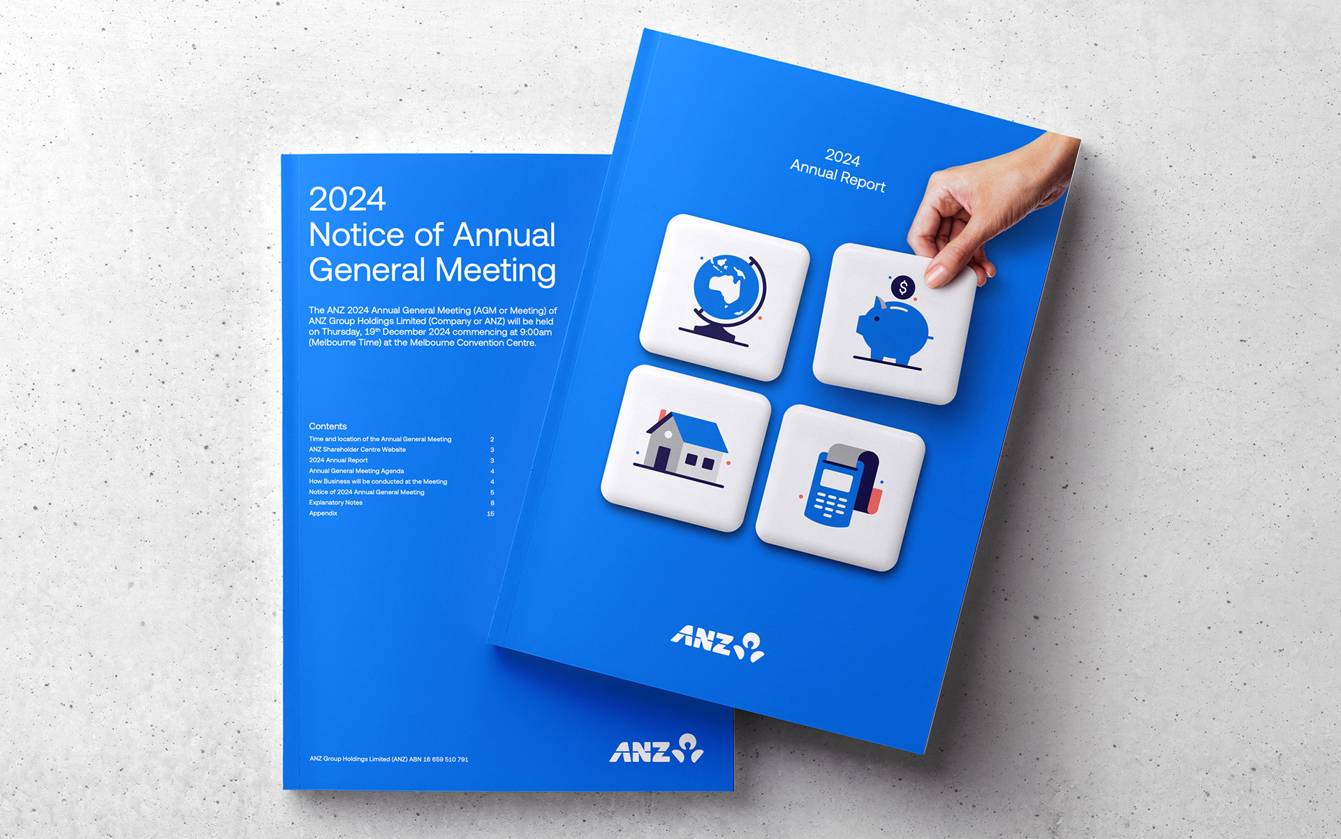
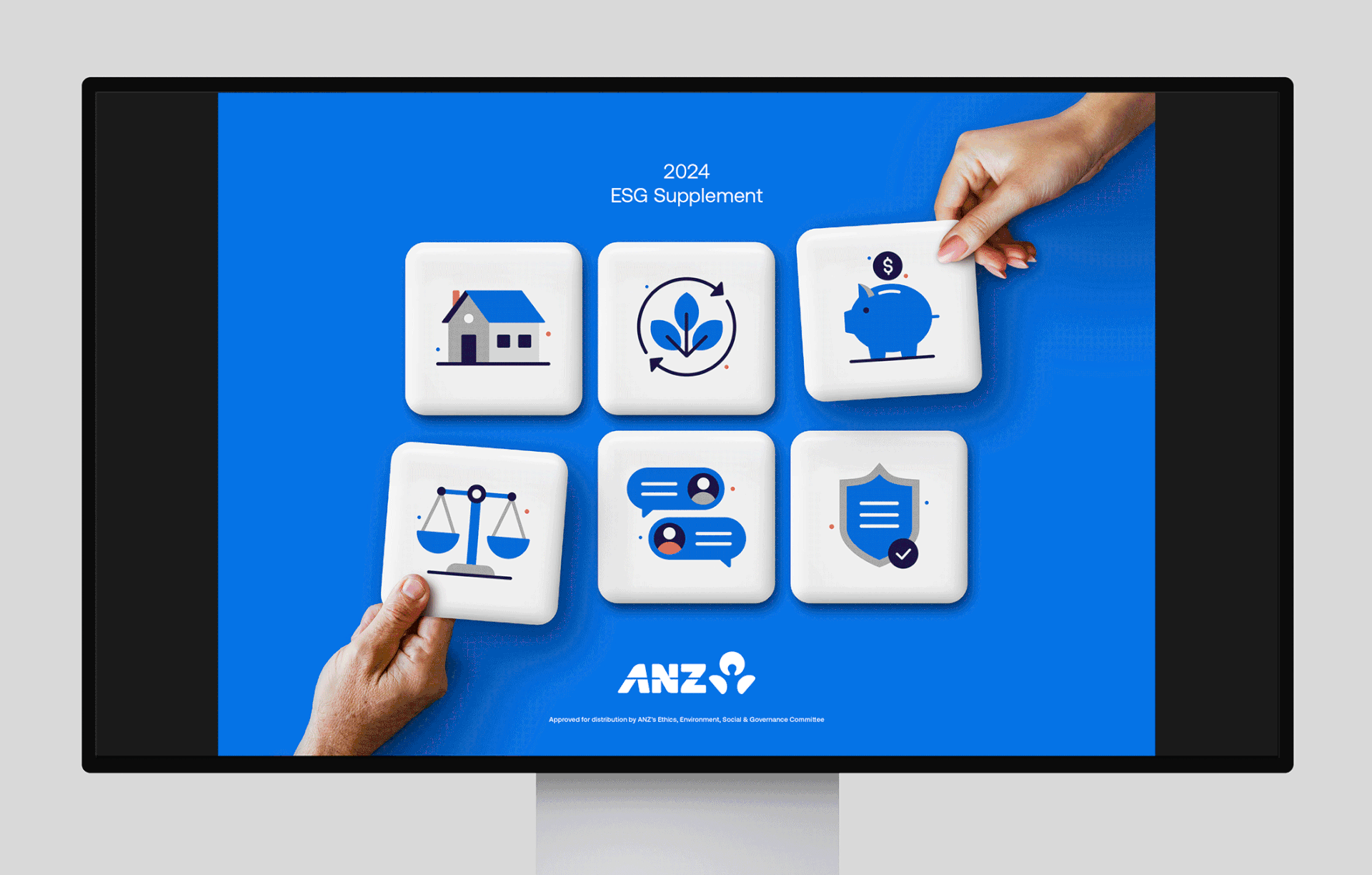
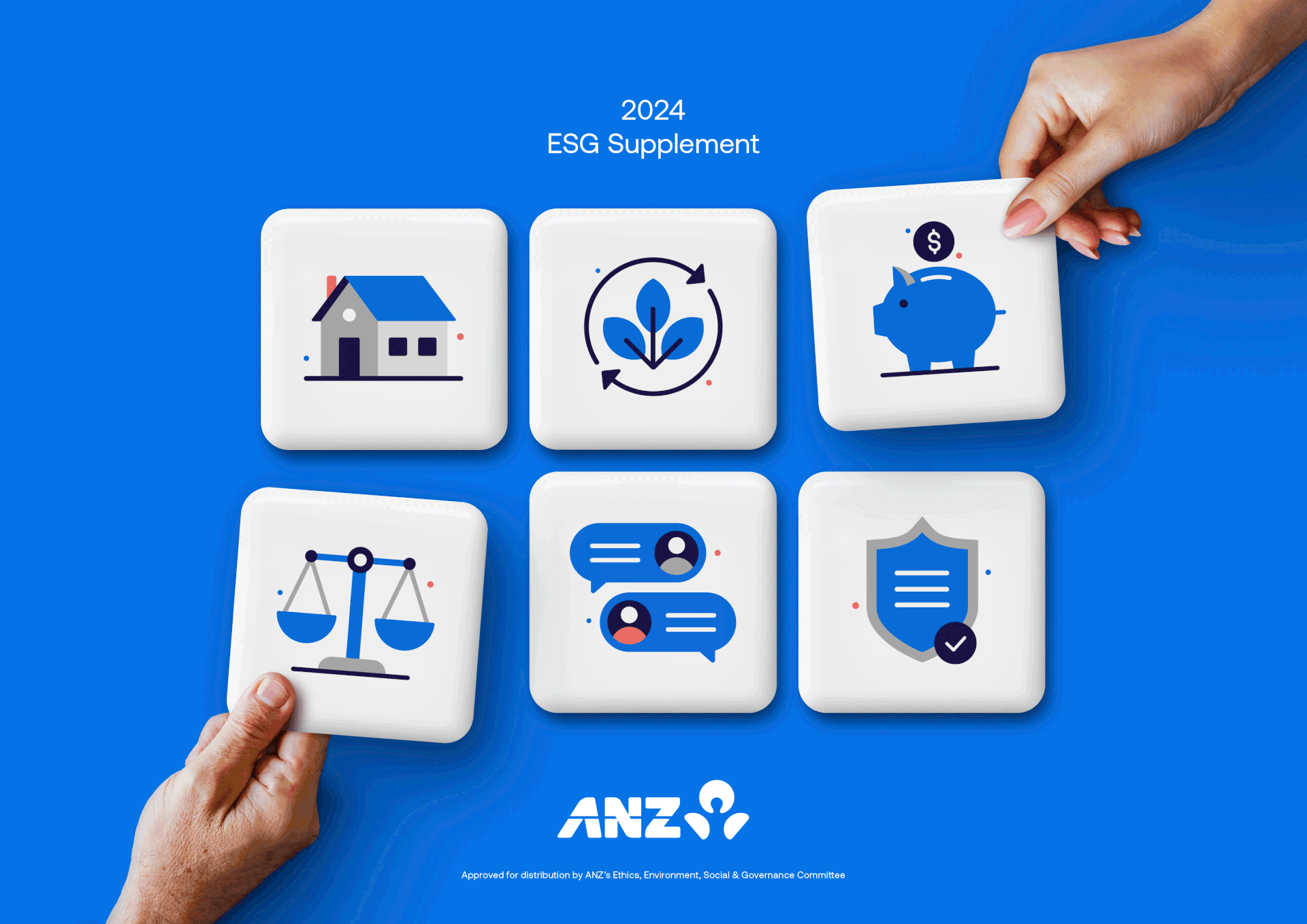
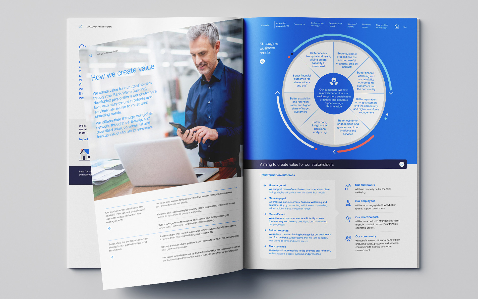
To infuse the reports with vibrancy and character, we introduced a series of 3D illustrations, each thoughtfully designed to reflect relevant key themes to the report’s content. A notable feature is the depiction of a hand holding one of the illustrative blocks, symbolising ANZ assembling the essential elements to effectively serve its customers. This visual metaphor reinforces the bank’s commitment to building and nurturing customer relationships.
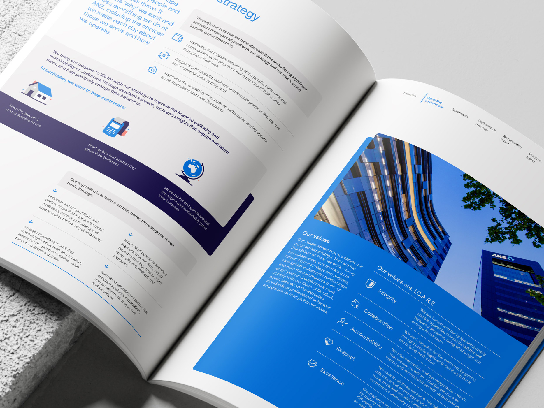
The new design system is clean and simple, conveying a sense of ease
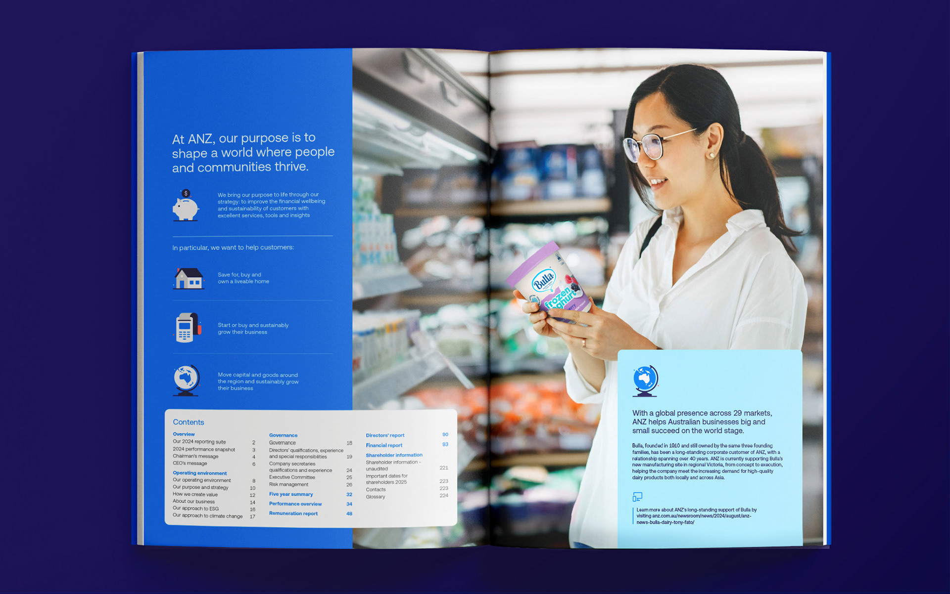
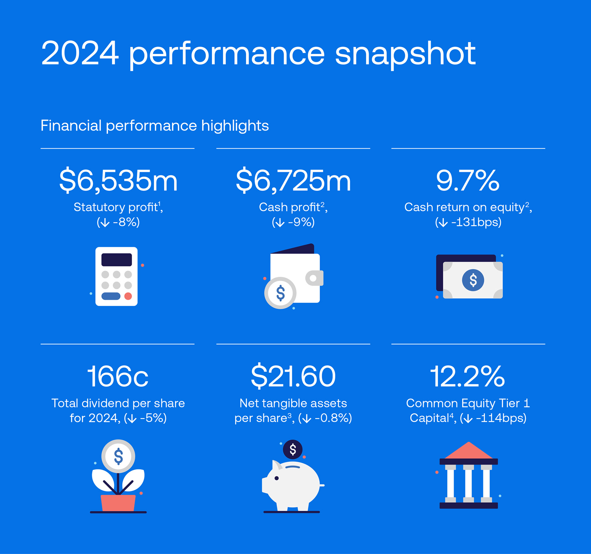
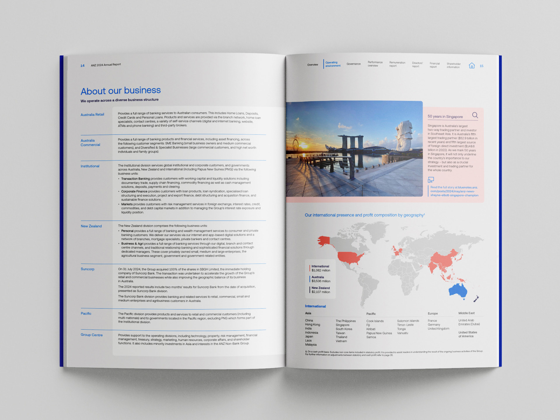
and accessibility. Our approach balances modern typography with intuitive layouts, ensuring that even the most intricate information is presented with clarity. By incorporating a strategic mix of icons and 3D illustrations, we highlighted critical insights such as performance snapshots, making complex data more digestible and engaging for the reader.
and accessibility. Our approach balances modern typography with intuitive layouts, ensuring that even the most intricate information is presented with clarity. By incorporating a strategic mix of icons and 3D illustrations, we highlighted critical insights such as performance snapshots, making complex data more digestible and engaging for the reader.
Functionality was paramount in our design choices. We maintained
a clear hierarchy, allowing readers to navigate seamlessly through various sections. The interplay of graphical elements, whitespace, and structured typography ensures that the reports are not only informative but also visually appealing, aligning with ANZ’s digital-first evolution.
a clear hierarchy, allowing readers to navigate seamlessly through various sections. The interplay of graphical elements, whitespace, and structured typography ensures that the reports are not only informative but also visually appealing, aligning with ANZ’s digital-first evolution.
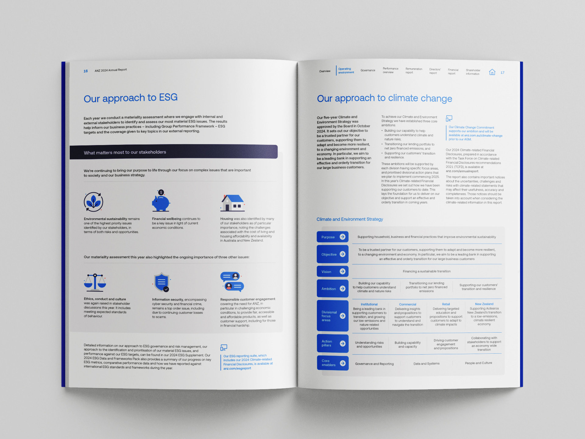
Central to the brand’s visual identity are the primary colors, Pacific Blue and Cloud White, serving as the foundation for immediate recognition and consistency across all brand touchpoints. Complementing these are seasonal colors, strategically utilised throughout the ESG reporting suite to enhance readability and guide the audience through distinct thematic areas. This thoughtful use of color segmentation helps reader to navigate, reinforcing ANZ’s commitment to clarity, accessibility, and innovation in corporate reporting.